Zaniya
Design
Description
Prospective client looking for a branding redesign
Overview
Valley Community Health Centers was looking to re-brand and overhaul their entire clinic. They are spread across two towns and three different clinics, so any branding around a location wasn't an option.
The clinics focus on affordable care and are proud of being one of the few clinics in the area that incorporated Behavioral Health into its practice. They were looking for a new name that encompassed the feeling of whole care.
Adapting from Feedback
- First, we gave some broad design choices to help them refine what they were looking for in a logo.
- They wanted a name that stood out in a community where "Valley" and "Prairie" were too often used in business names.
- They also expressed interest in something more abstract with ties to the Native American community.
Research
While researching the Native American culture in the area, we learned that the Lakota tribe was local to the region. Lakota is a beautiful and rich language, and served as inspiration for a branding direction.
- The word Zaniya translates to "being healthy, in good health and wellness".
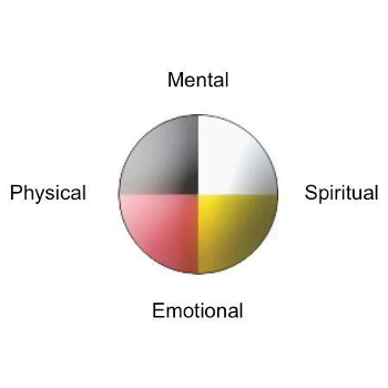
- The symbol for well being in Lakota is the medicine wheel featuring 4 colors, black, white, yellow and red.
- Each color represents a different area of wellness; mental, physical, emotional and spiritual.
Research
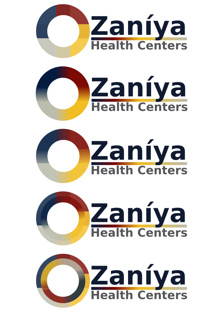
The logo for Zaniya is modeled after the medicine wheel while giving it a modern and more abstract twist. We muted the bold colors with warmer options to better reflect the welcoming feel of the clinics, and gave them a few different options to choose from.
Get in touch


